
Design
Permalink Design
In this area, you can configure the design for the message on the product page and you can also choose whether the message appear on the product page as simple text or as a Pop-up.
Permalink General
The options in the “General” area apply to both display types.
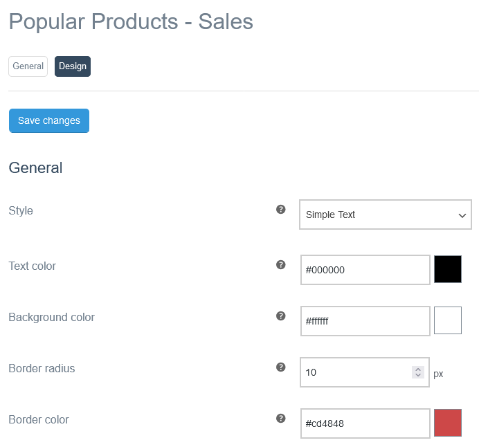
Style
Here you can set whether the message is displayed as “Simple Text” or as a “Pop-up”.
Text color
Here you choose the text color.
Background color
You can use this option to select a background color.
Border radius
The value entered in this field defines the border radius.
If you enter a “0”, no rounded corners will be displayed.
Border color
Here you define the border color.
Permalink Simple Text
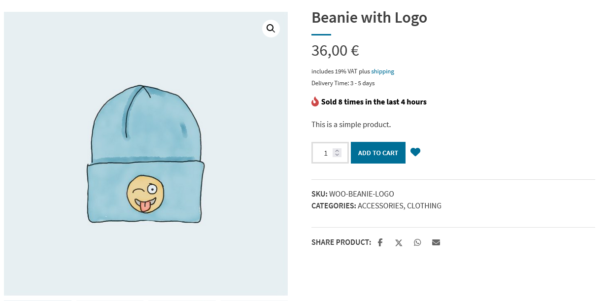
With the “Simple Text” style, the message appears as text with an icon (optional). In addition to the visual adjustments to the text, you can also change the position of the message and select an icon.
These options are available for the “Simple Text” style:
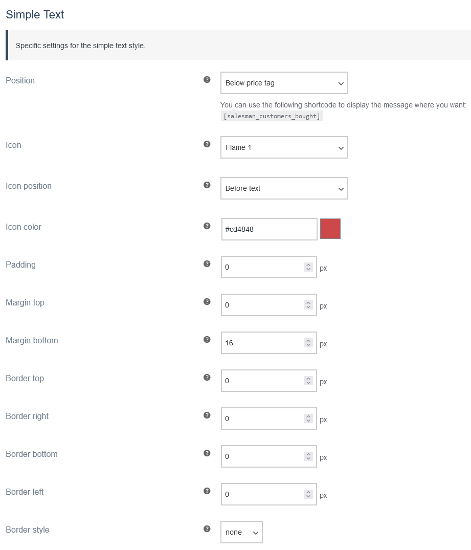
Position
Here you define the position of the message. You can choose from four different positions:
- Below price tag
- Below short description
- Below add to card form
- Shortcode only
If you select the option “Shortcode only”, the message is not automatically displayed. You can then use the shortcode [salesman_customers_bought] to display the message on the product page.
Icon
Here you can choose from five different icons that can be displayed in the message.
- Flame 1
- Flame 2
- Shopping Bag
- Shopping Basket
- Shopping Cart
Alternatively, you can also deactivate the usage of an icon with the “No icon” option.
Icon position
Here you can specify where the icon is displayed.
These two positions are available:
- Before text
- After text
Icon color
Here you can select the icon color.
Padding
Enter the value for the inner spacing here.
Margin top
Enter the value for the upper outer spacing here.
Margin bottom
Enter the value for the lower outer spacing here.
Border top
Set the thickness of the top border.
Border right
Set the thickness of the right border.
Border bottom
Set the thickness of the bottom border.
Border left
Set the thickness of the left border.
Border style
You have five different options for the border style.
“none” is set by default.
- none
- solid
- dashed
- dotted
- double
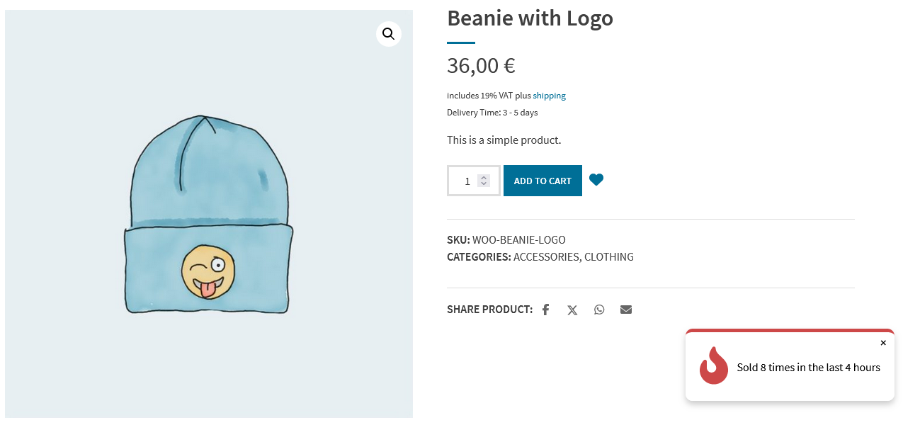
Permalink Pop-up
If you select the “Pop-up” style, the message will appear in a pop-up with an icon (optional). You can change the position of the Pop-up, choose an icon and make visual adjustments to the Pop-up.
These options are available for the “Pop-up” style:
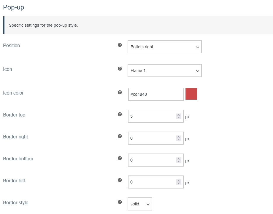
Position
Here you define the position of the Pop-up. You can choose from four different positions:
- Top left
- Top right
- Bottom left
- Bottom right
Icon
Here you can choose from five different icons that can be displayed in the message.
- Flame 1
- Flame 2
- Shopping Bag
- Shopping Basket
- Shopping Cart
Alternatively, you can also deactivate the usage of an icon with the “No icon” option.
Icon color
Here you can select the icon color.
Border top
Set the thickness of the top border.
Border right
Set the thickness of the right border.
Border bottom
Set the thickness of the bottom border.
Border left
Set the thickness of the left border.
Border style
You have five different options for the border style.
- none
- solid
- dashed
- dotted
- double