Gutenberg blocks
Permalink Gutenberg blocks
Our WordPress theme Atomion features three of our own blocks in addition to the standard Gutenberg blocks:
- Hero Slider: For slider creation and configuration
- Content-Box: For the consistent display of multiple text elements
- Icon-Box: For the display of icons in combination with multiple text elements
Permalink Hero-Slider
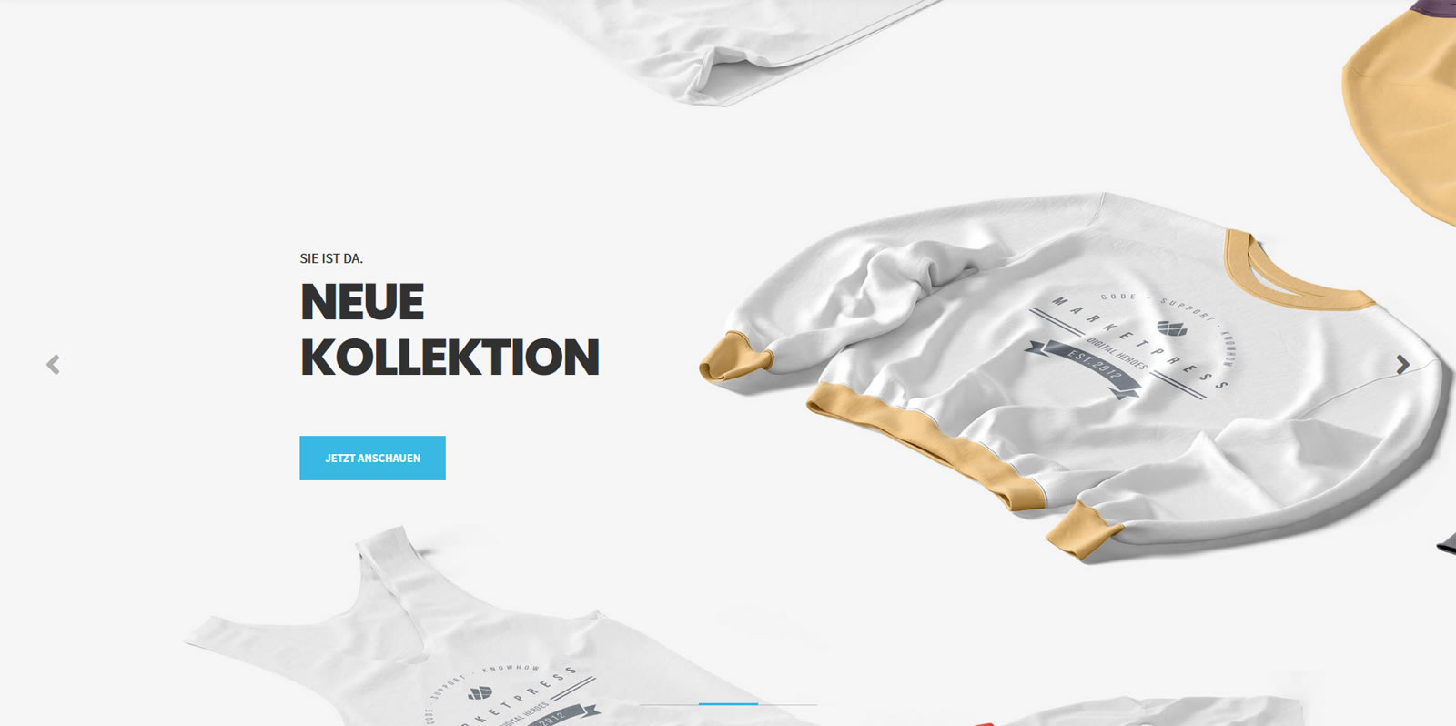
This block facilitates the quick, simple integration of a slide show into your pages and posts. You can save up to three different slides per block. The slider is always displayed across the entire width of the respective post or page. You also have the option to incorporate multiple sliders into a single page or post. Many of the settings you configure in the Editor may not be visible in the backend even though they are properly displayed in the frontend.
General slider settings
Dots
Activates/deactivates slider navigation dots.
Arrows
Activates/deactivates slider navigation arrows.
Autoplay
Activates/deactivates slider autoplay.
Autoplay Speed
Sets the speed at which slider images change. The value is entered in milliseconds, so enter 3000 milliseconds if you want a 3-second interval between changes.
Infinite loop sliding
Plays the slider in an infinite loop. When infinite slide looping is active the slider automatically returns to the first slide after the last slide. This is automatically the case if autoplay is on, so this function is particularly useful in combination with manual navigation.
Pause on Hover
Activates/deactivates the autoplay pause function, which pauses the slideshow when the mouse hovers over a slide. Autoplay resumes when the mouse moves away from the slide.
Slide Effect
The two different effects available control how the slide show switches from one slide to the next:
- Swipe: The current slide is pushed towards the left-hand edge of the screen. The new slide simultaneously arrives from the right-hand edge of the screen and stops where the old slide was previously positioned.
- Fade: The new slide fades in as the old slide simultaneously fades out.
Slide-specific settings
These settings can be applied to any individual slide:
Active
Activates/deactivates this slide.
Alignment
Use the toolbar to set whether the slide text should be flush left, centered or flush right.
Pre-Headline
The short text you enter here will be displayed above the main headline in a smaller font size.
Headline
Text field for the main headline within the slide.
Text Color
Set a color for the pre-headline and headline. You can either choose one of 11 default colors or select the color of your choice from the palette.
Image URL
Define the image to be shown on this slide. Replace our default placeholder image by entering the URL of the image you wish to be shown. Not sure what the URL is? Simply browse your media library for the image, copy its URL and paste it into the field.
Image position (mobile devices)
Set where the image should be shown when the page is viewed on mobile devices (<767px). From a screen size of 767px upwards the height of the slider corresponds with 60% of the mobile device’s screen. As a result it is often sensible to change the position of the image in order to ensure that key elements remain visible.
Button Style
There are two different button styles to choose from: Outline and Filled. The way the button is shown on the slide varies depending on your choice. The button adopts the same highlight color as the general highlight color set in the Customizer. At the time of writing that color is only visible in the frontend (i.e. on the page itself and not in the Editor).
Button Text & Button Link
The next two fields are used to enter the button text and button link.
Button Outline Color
If you selected Outline under Button Style you can opt to also apply the outline color to the button when it is in its normal state.
Permalink Content-Box
Our next block is the Content Box, which allows you to define a pre-headline, headline, content and a button. The fact that this block bundles four elements into one not only enhances the appearance of your content, but also enables you to work with columns without every single element moving to a separate row.
The block takes the following structure:
- Pre-Headline (a short text before the main headline)
- Headline (main headline)
- Content (text)
- Button (optional, contains style, text and link)
Alignment
You can use the toolbar to align the headlines, text and button. The block can be aligned flush left, flush right or centered. The setting you select will be applied to the whole block.
Pre-Headline
The short text you enter here will be displayed above the main headline in a smaller font size. The block options also enable you to specify a color for the pre-headline. You can either choose one of 11 default colors or select the color of your choice from the palette.
Headline
This block enables you to select a headline tag. Use the selection field to define the tag the headline is given in source code (h1, h2, h3 or h4). This does not affect the way the headline is displayed. This function is designed to help you set your post up for enhanced SEO.
Content
Insert any content you wish to add as standard text here. You can also highlight text by setting it in bold and/or italics, add links and strike through specific passages.
Button
The button in the Content Box is optional and can be deactivated in your block options, where you can also set a button style (Outline or Filled), button text and a link for the button. The button adopts the same highlight color as the general highlight color set in the Customizer. At the time of writing that color is only visible in the frontend (i.e. on the page itself and not in the Editor).
Permalink Icon-Box
The Icon Box enables you to display an icon with three text elements.
Icon
You can choose any free Font Awesome 6.5.1 icon (or upgrade to Pro).
Here’s how to add an icon to the Icon Box: Navigate to https://fontawesome.com/icons/ pick out a suitable icon, copy the CSS class out of the HTML code (e.g.: fab fa-facebook-f) and enter it into the corresponding field in the Icon Box.
The icon options allow you to either choose one of 11 default colors or select the color of your choice from the palette.
A sliding bar enables you to adjust the size of the icon.